The founders of Christofle (Paris), the venerable French silver company, didn’t consider the impact of “branding” and “customer engagement” back in 1813 when they began producing the classic creations that have graced the tables of royalty and dining rooms onboard luxurious transatlantic ocean liners and in today’s finest restaurants.
But they must have instinctively understood the value of these attributes or they wouldn’t be thriving today, more than 200 years later. They even had a corporate logo – a bee emblem that marked each piece – a regal symbol of the French empire.
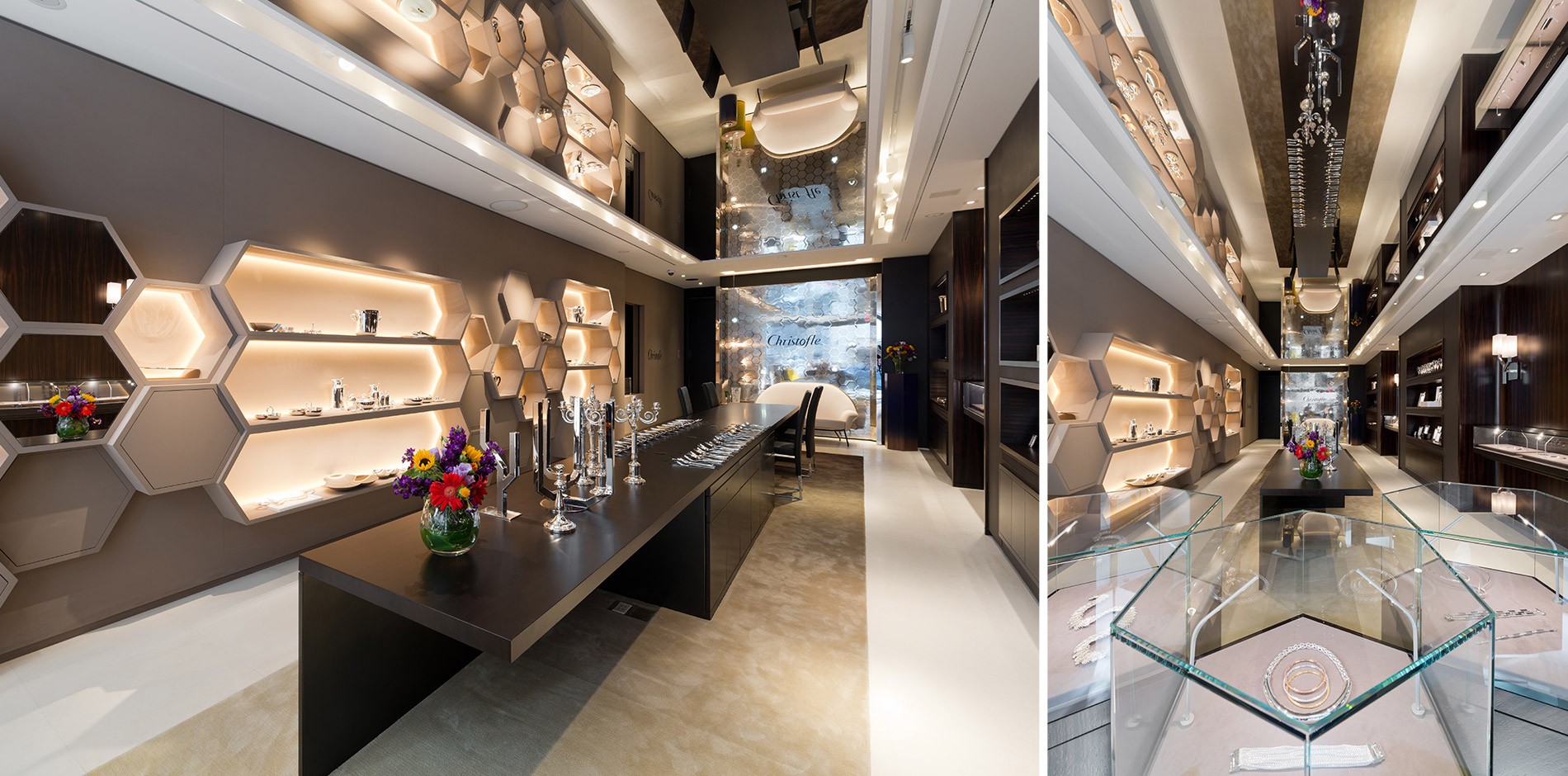
To this day, the humble insect distinguishes Christofle’s one-of-a-kind pieces and is carried through the design of the company’s new Beverly Hills, Calif., flagship.
The elegant, modern boutique showcases Chistofle’s sterling, silver-plate and stainless flatware in an intimate, homey space that encourages customers to leisurely and carefully consider what is often a major purchase intended to last a lifetime and to be handed down to future generations.
Stéphane Parmentier, creative director, Christofle, envisioned a fresh, updated expression of the brand’s classic aesthetic for the west coast store. (He designed the company’s New York store as well, in addition to stores in London, Shanghai and Hong Kong.)
Partnering with Shawmut Design and Construction (Los Angeles) and O’Neil Langan Architects (New York), Parmentier created a jewel box-like space that showcases Christofle’s extensive line and includes crystal vases and glassware, porcelain dinnerware and sculptures created especially for the flagship.